


SafeAlert
A mobile application that allows schools and organizations to alert their community, communicate and reach safety.
A mobile application designed to provide organizations, schools, and communities with a swift, reliable network for alerting members, communicating status, and guiding people to safety during an emergency.
The Challenge: A Path to Safety
During a state of emergency, panic and disorientation are common, especially in high-density settings like schools. Users needed a tool they could trust to deliver efficient guidance and continuous communication with authorities.
The core challenge was framed by two questions:
How might we provide a swift network of communication during the state of emergency?
How might we provide information that is accessible to all groups of people during an emergency?
My Role & Process
Product Designer | Timeline: 4 weeks | Tools: Figma, Miro
I worked on this project as a product designer along with Paula Barberi a fellow designer, throughout the course of a month.
Key responsibilities included:
UX research and analysis
UI Design
Low/High Fidelity Prototype Development
Card Sorting
Using affinity mapping and Card Sorting on interview data, we synthesized key information from community members (teachers, law enforcement, managers). This process clarified which features were most critical during an emergency, leading to the following priorities:
Communication Network: Users prioritized simple, rapid ways to contact family and authorities.
Accessible Guidance: A clear need for intuitive instructions (visual cues, not just text) and easy navigation.
Role-Specific Utility: The app must be highly useful for both vulnerable groups and leadership roles (teachers, first responders).
This synthesis mandated that our core strategy prioritize efficient, intuitive guidelines over overwhelming users with excess information, directly informing our key application features.
Exploring the Problem
Storyboard Sketches
To visualize the flow, we storyboarded the end-to-end user experience. The narrative highlights the critical path: receiving the initial danger alert, identifying the safest evacuation route via the in-app map, and utilizing communication features to reach a secure area. This visualization was crucial for ensuring the screen sequence remained simple and actionable during peak stress.
User Journey
We mapped the high-stress user journey from Initial Alert to Reaching Safety. The critical pain point was "Confusion and Isolation," defined by a lack of clear instructions and communication. The mandate was to minimize cognitive load using visual guidance and one-tap communication.
Refining the Path to Safety
Our primary objective was testing for usability and immediate ease of use, as the product must function reliably under high stress. We tested a diverse group including teachers, a student, a police officer, a nurse, and a department store manager. Key findings led to the following design iterations:
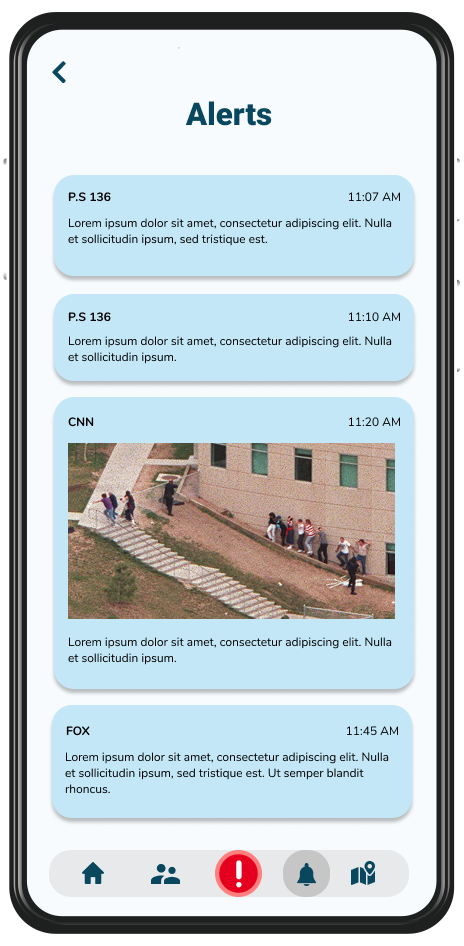
Actionable Alerts: Implemented a single, double-tap alert button to instantly notify the community and authorities, satisfying the need for high-priority, Amber Alert-style warnings.
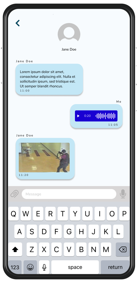
Rapid Communication: Added simplified contact features to allow users to quickly reach family and local authorities simultaneously.
Intuitive Guidance: Integrated a dynamic, visual mapping system providing clear, accessible safety routes to counter user disorientation.
Trust and Reliability: Established speed and reliability benchmarks against known public safety applications to ensure user trust during an emergency.

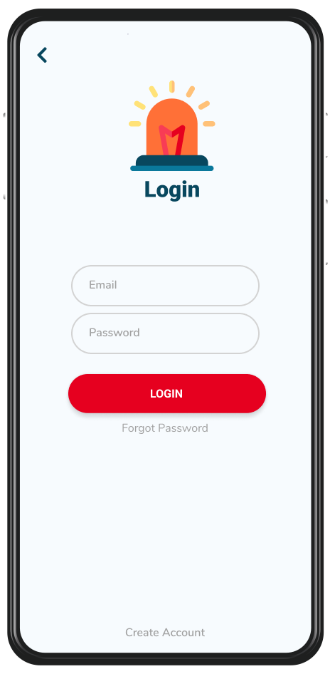
Alert and Ready
With the feedback on the usability issues and a user journey for reference, we started designing the final screens in Figma. Using our developed branding guidelines, we completed a high fidelity prototype. These features work to create an intuitive experience that guides users to safety while taking into consideration their high pressured state. Now users have a tool that can keep them and their loved ones safe in precarious situation.


Results and Takeaways
This project confirmed that in a high-pressure scenario, less is fundamentally more. Our focus on streamlining communication and minimizing cognitive load resulted in a high-fidelity prototype that users found highly intuitive and reliable.
Key Takeaways:
Design for Urgency: The dynamic map and one-tap alert system successfully addressed the critical need for visual guidance and instantaneous action, which are vital when verbal instructions fail.
Iterative Validation: The most crucial element of the process was the willingness of community members (teachers, police) to provide feedback, ensuring the final design met real-world safety requirements and maximized accessibility for all groups.
Designing for emergencies reminded me that usability is only half the challenge — the other half is emotional design. People under stress don’t just need clarity; they need calm. This project helped me refine my approach to simplicity, trust-building, and designing for emotional safety.