


Trust Center
Redesigning the Privacy Policy & Terms of Use Experience for DDM
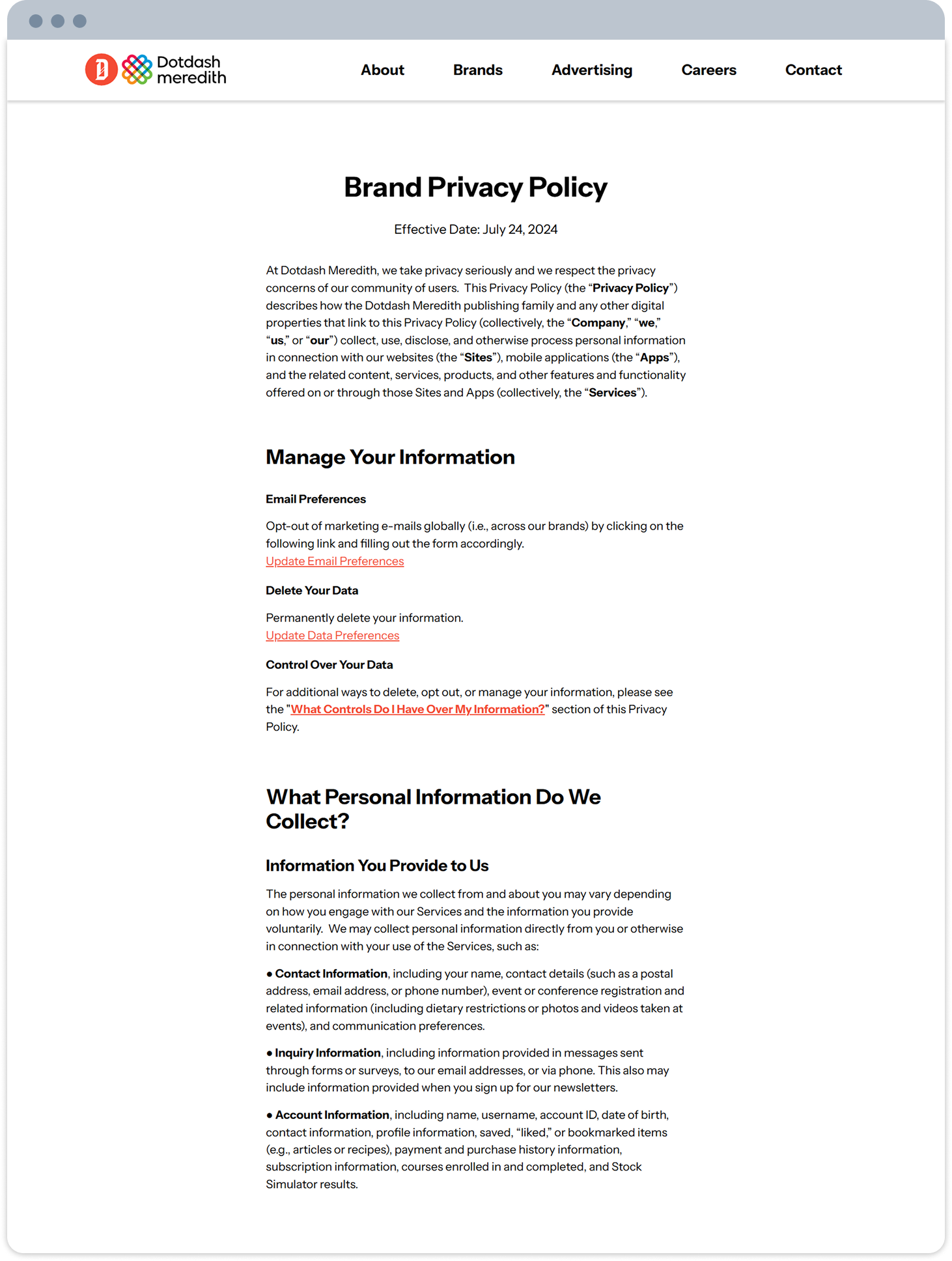
DDM’s privacy policy page was dense, difficult to navigate, and failed to inspire trust — a common issue in data-driven organizations. The Privacy & Trust team approached the revenue design group with a pressing problem: user engagement on the Privacy Policy and Terms of Use pages was declining, and legal stakeholders struggled to manage content. Users reported the pages felt cluttered, poorly organized, and hard to understand. The goal was clear:
"Create a centralized, intuitive, and trustworthy legal experience that simplifies complex policy access for privacy-minded users."
My Role & Process
UI/UX Designer | Timeline: 5 weeks | Tools: Figma, FigJam, Prismic
As the UI/UX Designer, I was responsible for the entire redesign effort, from initial research through developer handoff.
Key Responsibilities:
UX Research and Competitive Analysis
UI Design, Visual Hierarchy, and Information Architecture
Developing Responsive Designs for all breakpoints
Final Figma Handoff and Developer Collaboration
Competitive Benchmarking
To establish best-in-class standards for clarity and accessibility, I conducted a competitive analysis of companies like Disney and T-Mobile. The goal was to understand how large organizations successfully compartmentalize complex legal documentation.
Key Design Takeaways:
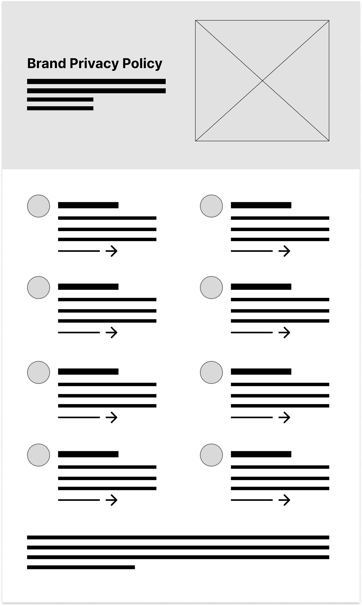
Centralized Hub Model: Successful competitors use a single "Privacy Hub" to allow users to easily toggle between all legal documents (Policy, Terms of Use, Data Control) from one location.
Progressive Disclosure: Content must be broken down using expandable tiles or collapsible sections to reduce visual overload and improve scannability.
Immediate Navigation: Implemented jump points/in-page navigation to quickly take users to specific legal topics without excessive scrolling.
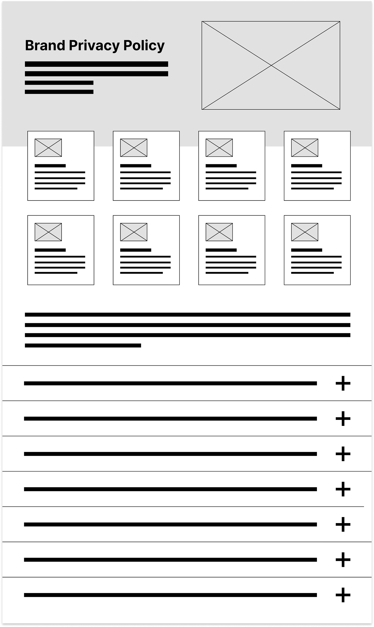
Wireframing & Iteration
I began the design phase with low-fidelity sketches to explore various Information Architecture patterns for the centralized Privacy Hub. Then after testing multiple layouts and visual hierarchy options, I transitioned into high-fidelity Figma designs, refining the structure based on stakeholder feedback.
As direct usability testing was constrained, design validation relied on intensive internal reviews with the Legal and Content teams. Their feedback was essential for ensuring the modular layout balanced compliance requirements with critical user readability goals.
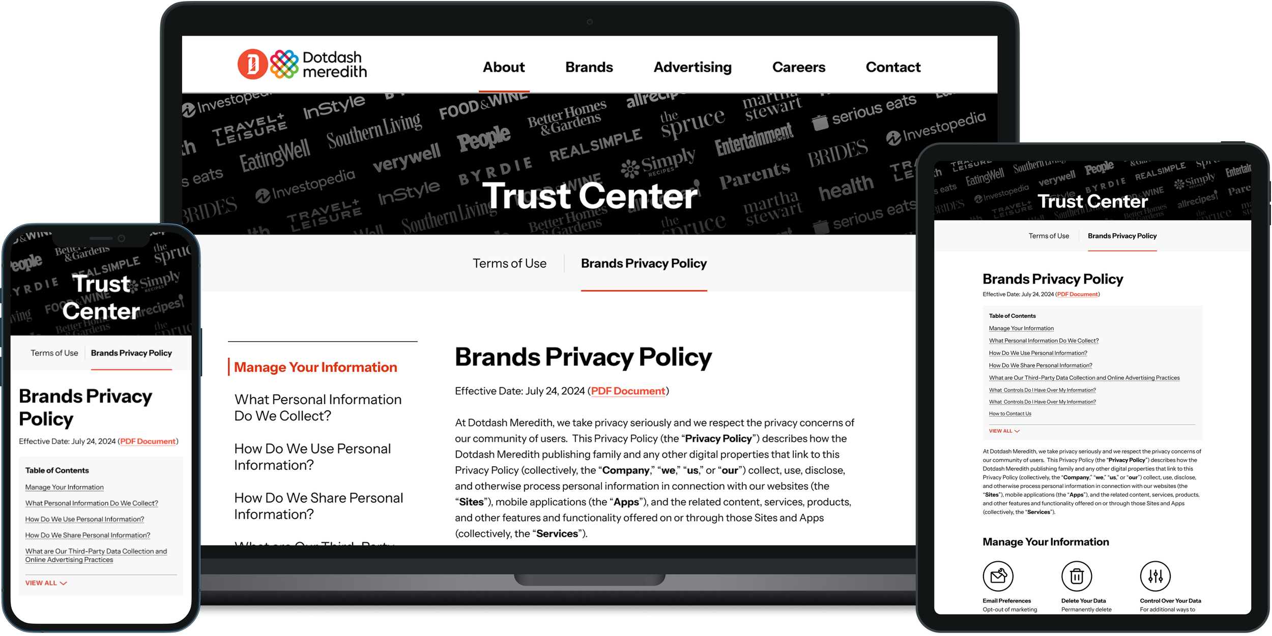
Solution: New Trust Center
Accessibility was a core requirement. We used plain language and clear visual hierarchy to reduce cognitive load, ensuring the design met guidelines with high color contrast across devices.
After multiple rounds of iteration and consensus from Legal, Privacy, and Engineering teams, I finalized a modular design system that delivered:
Clear Navigation: A centralized hub facilitating seamless toggling between legal documents.
Readability & Scannability: High-contrast text, optimized line length, and the use of progressive disclosure via expandable modules.
Technical Scalability: A modular design system built for responsive breakpoints (mobile, tablet, desktop) that can easily accommodate future legal changes and new policies.
The final Figma file, complete with detailed specifications and assets, was delivered for implementation.
Results and Takeaways
After multiple rounds of iteration and consensus from Legal, Privacy, and Engineering teams, I finalized a modular design system that delivered:
Clear Navigation: A centralized hub facilitating seamless toggling between legal documents.
Readability & Scannability: High-contrast text, optimized line length, and the use of progressive disclosure via expandable modules.
Technical Scalability: A modular design system built for responsive breakpoints (mobile, tablet, desktop) that can easily accommodate future legal changes and new policies.
The final Figma file, complete with detailed specifications and assets, was delivered for implementation.
This project reinforced my belief that clarity and empathy are inseparable in designing for trust.