

DermaKin
A calm, routine-first skincare experience designed to bring clarity to an often overwhelming space
Simplifying Skincare
DermaKin is a skincare guidance app that helps users better understand their skin and build a simple, effective routine without feeling overwhelmed. The goal wasn’t to diagnose or over-educate, but to offer structure, reassurance, and a sense of direction—especially for people who feel unsure if they’re doing “too much,” “not enough,” or the wrong things altogether.
Role: UX/UI Designer | Timeline: 6 weeks | Platform: Mobile (iOS) | Tools: Figma
Problem & Opportunity
Skincare is often presented through dense ingredient lists, conflicting advice, and aggressive product marketing. As a result, many people are left second-guessing their routines and feeling unsure about what their skin actually needs.
Rather than needing more information, users often need clearer guidance and reassurance—especially at the moment they’re making decisions. This felt like an opportunity to design a skincare experience that focuses less on complexity and more on calm, understandable structure.
Early Exploration
Early exploration focused on how people mentally approach skincare. A lot of the frustration wasn’t about access to products or knowledge—it was about confidence.
Ingredient-heavy education flows, diagnosis-style results screens and product-first recommendation models quickly felt overwhelming or impersonal.
Through sketching and early wireframes, it became clear that a routine-first experience felt more intuitive and supportive. Users didn’t want to be experts—they wanted to feel guided.
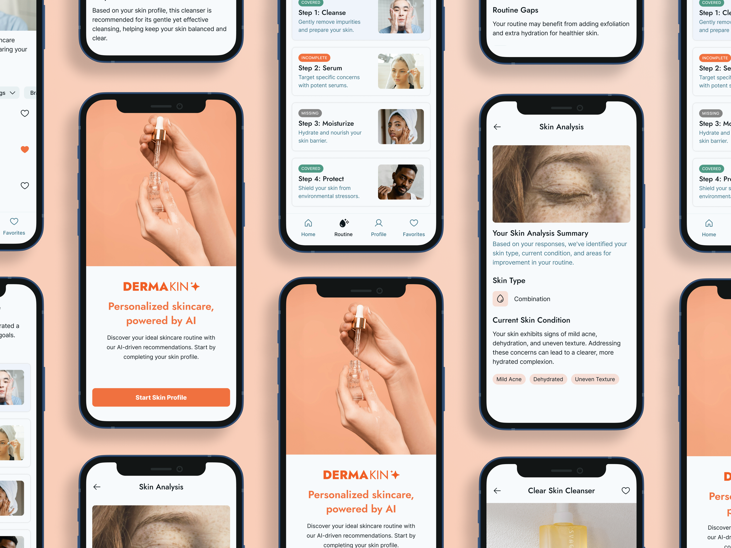
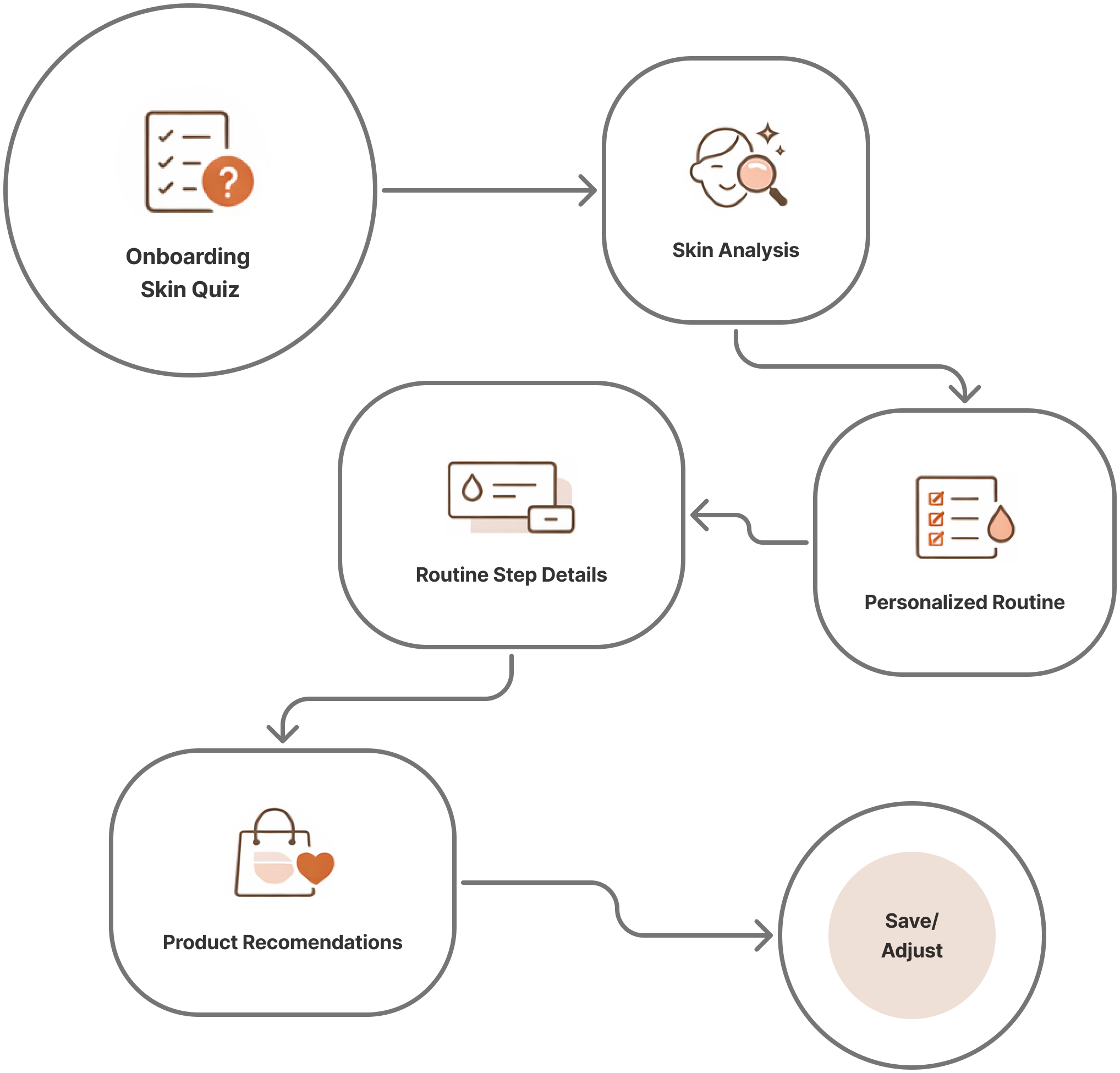
User Journey
The experience was designed to feel steady and supportive, moving step by step without rushing the user.
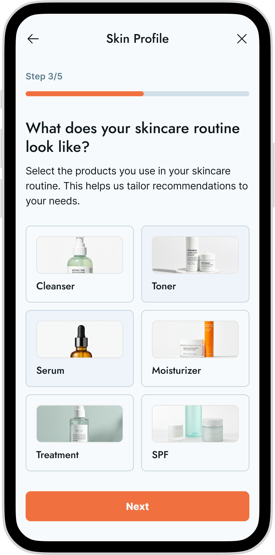
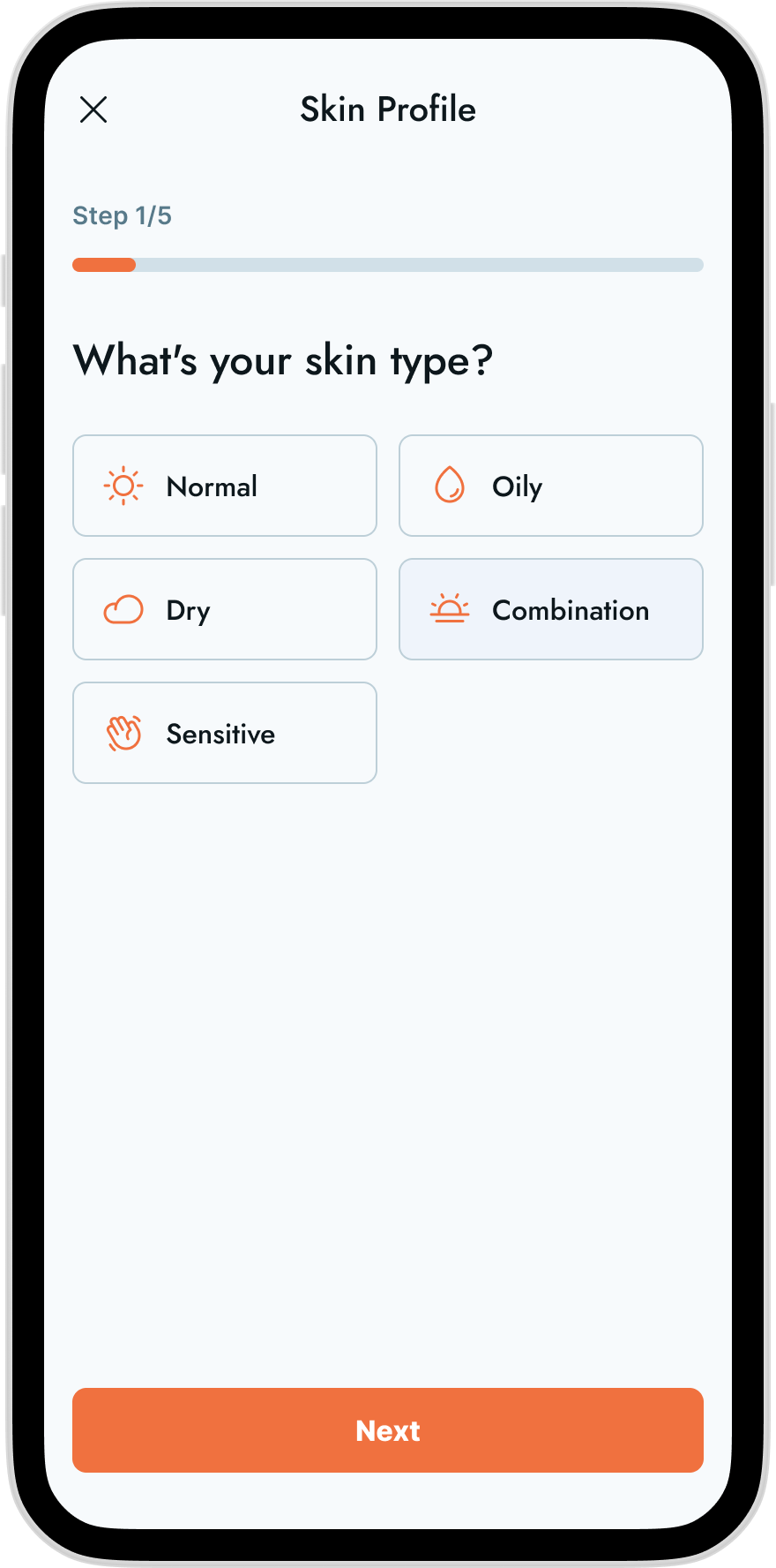
Skin Quiz – Gathers lightweight inputs to understand the user’s skin
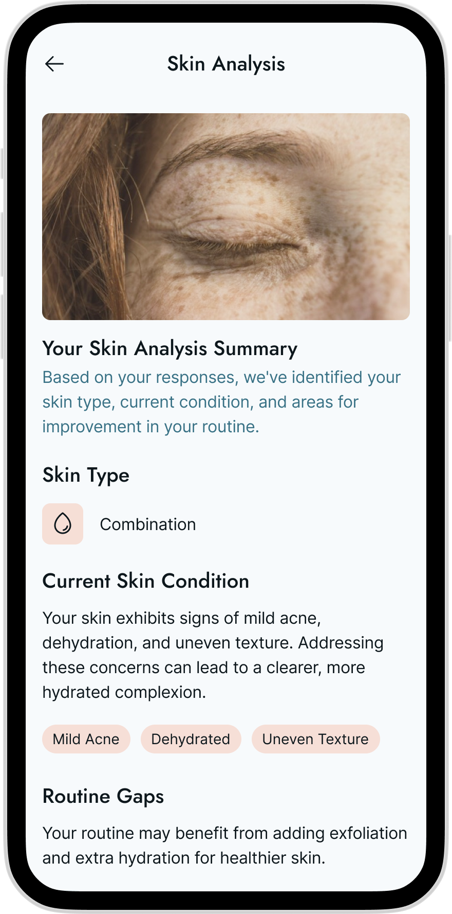
Skin Analysis – Summarizes insights in clear, non-alarming language
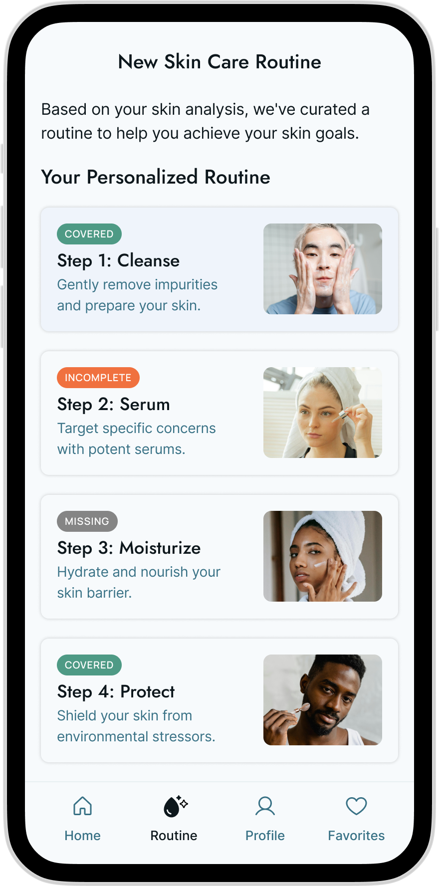
Personalized Routine – Introduces skincare as a set of manageable steps
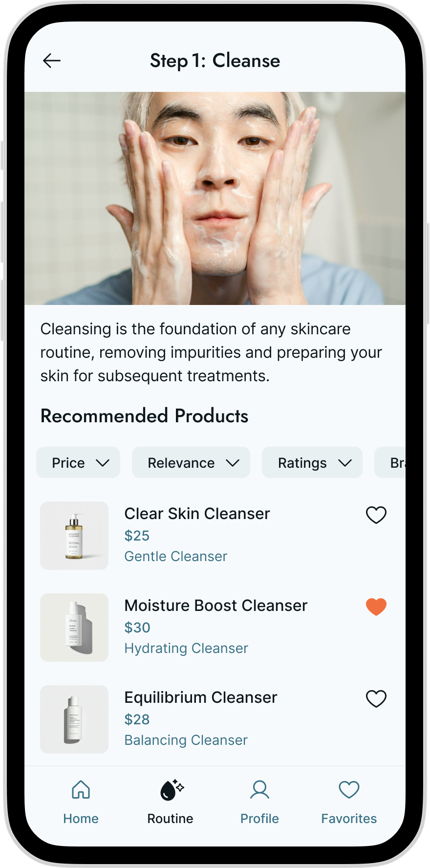
Routine Step Detail – Explains what each step does and why it matters
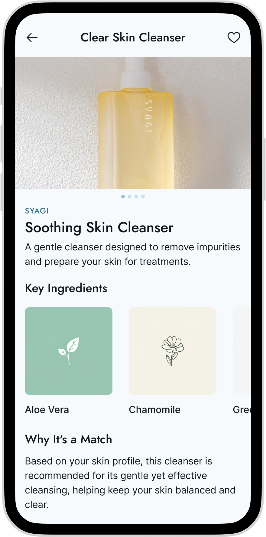
Product Recommendations – Shown contextually, with filters for price, relevance, and reviews
By grounding recommendations in routine steps, users understand the purpose of a product before being asked to choose one.
Design Rationale
DermaKin was intentionally designed to reduce decision fatigue. Instead of leading with ingredients, diagnoses, or endless product grids, the experience centers around routine as the primary interface.
The idea was simple: if users feel grounded in what they’re doing and why, the product choices become far less overwhelming. Product recommendations act as support—not the starting point.
Key Screens & Experience

Visual Design
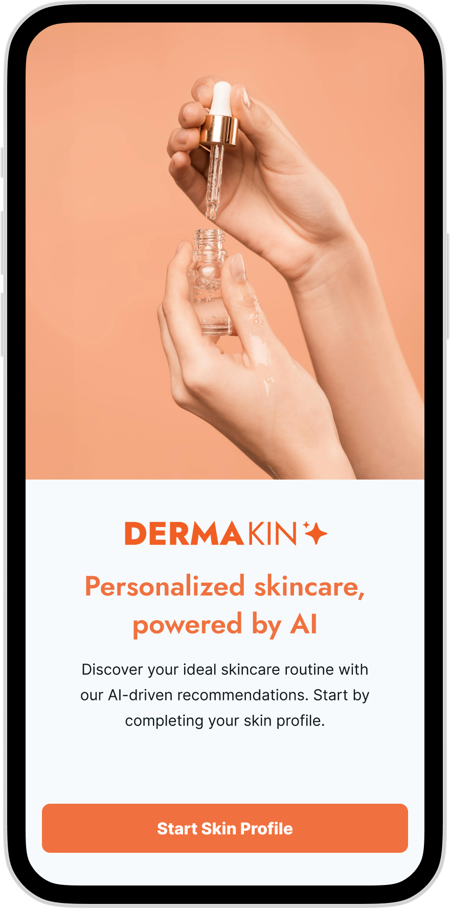
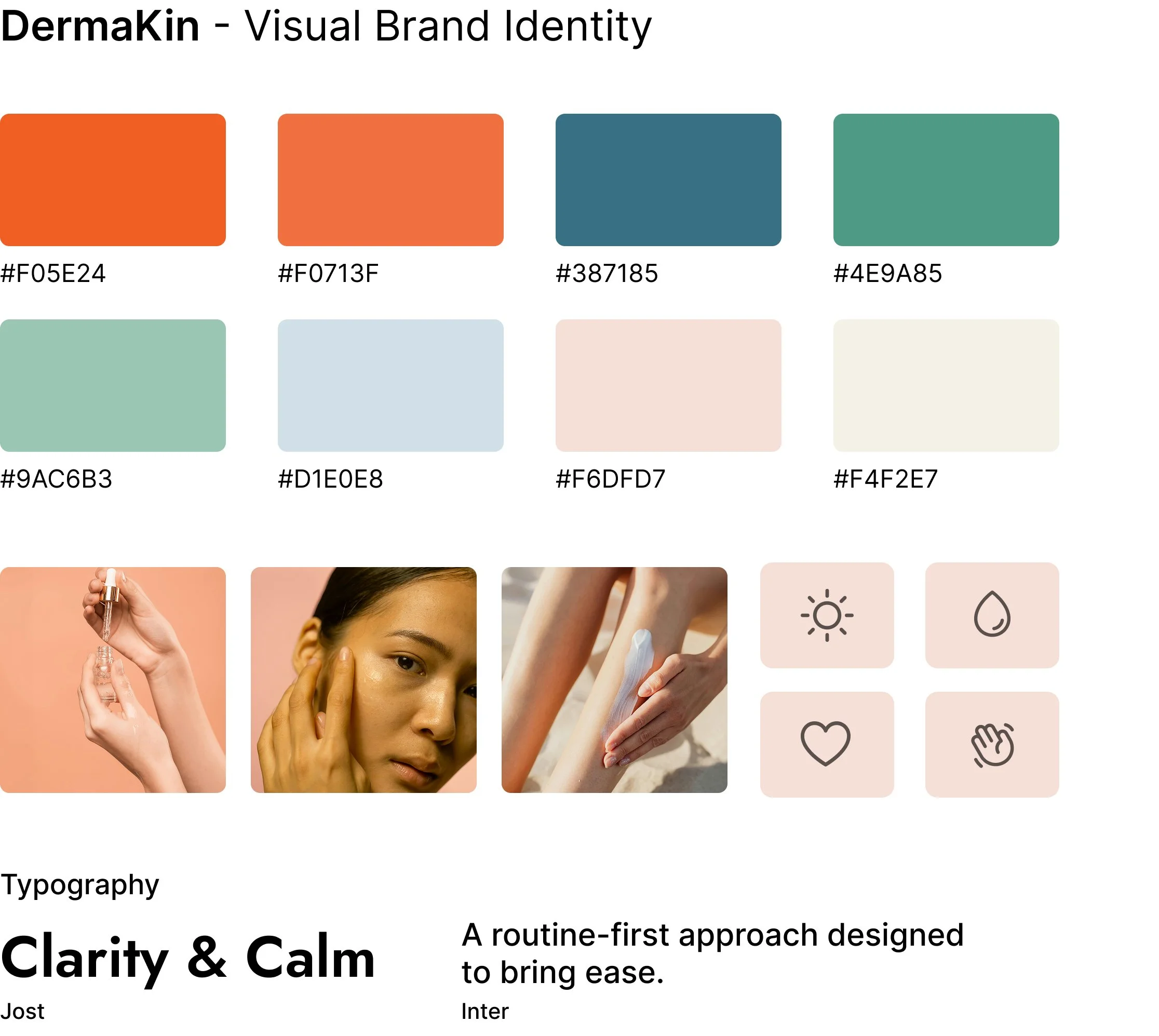
The visual language of DermaKin leans warm, calm, and neutral. The color palette and spacing were chosen to feel approachable and human—avoiding both medical sterility and overly aesthetic skincare branding.
The goal was to create an interface that feels reassuring rather than prescriptive.
Results and Takeaways
DermaKin explores how structure and clarity can be more valuable than depth in a complex space like skincare. By focusing on routine first and information second, the experience helps users feel more confident in their decisions instead of overwhelmed by them.
Future iterations could explore progress tracking, seasonal routine adjustments, and deeper personalization over time.